


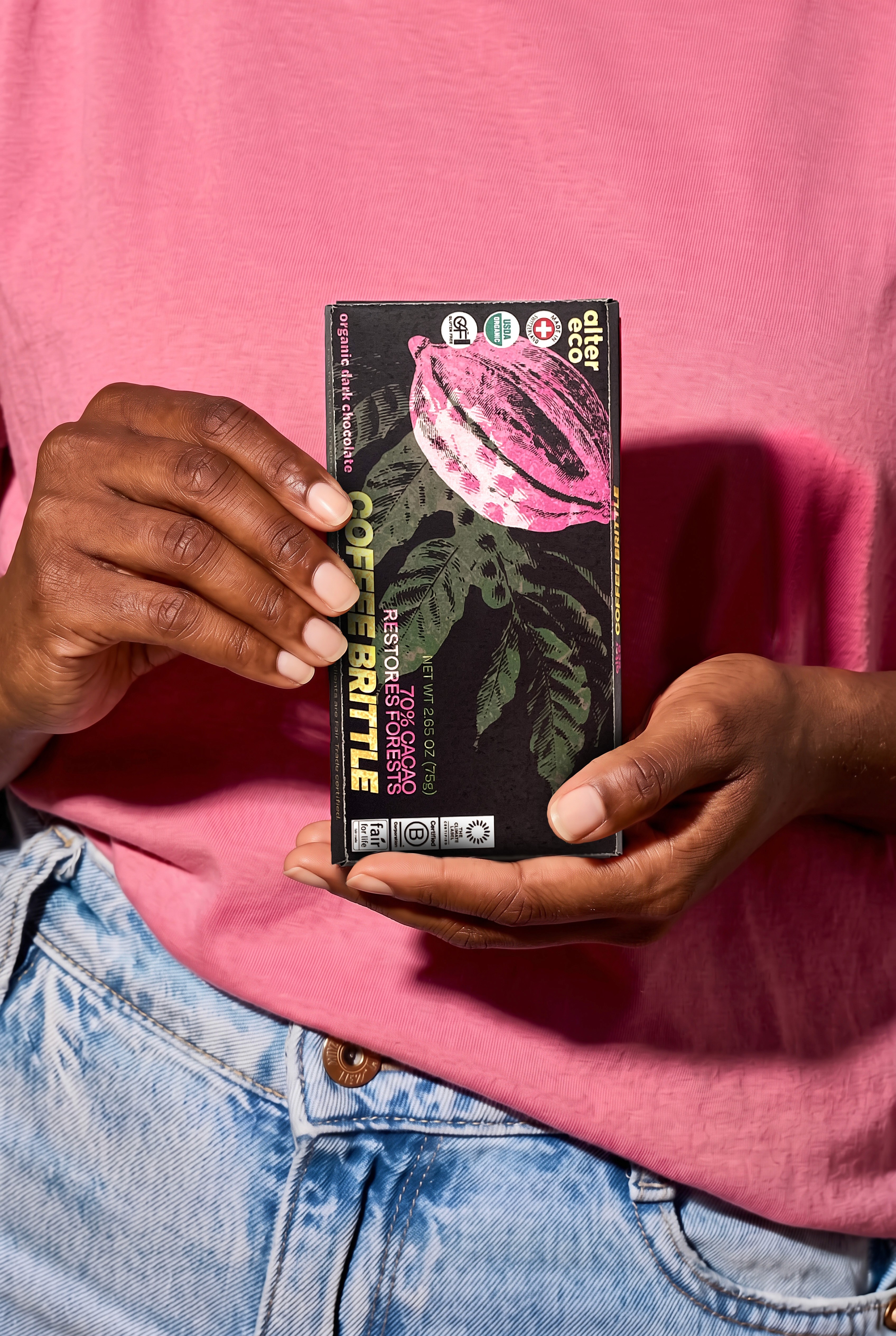
This project for me was an exploration into Photoshop effects and all of that good stuff. To create the overlay effect I used a combination of layer blending modes and transparency. This allowed me to have a limited color palette but a concise design that flowed together and matched the grunge, screenprinted look that was the goal. It was also just a lot of fun. Transitioning the bar's orientation from vertical to horizontal also allowed for more space and movement of the badges, letting them be arranged and separated by shape rather than all clumped together in one corner. But, side note, it's very bitter chocolate. I know it's coffee but still.
Ok, but what about advertising?
I gotcha there. The style of this package is easily transferable across different products, flavors, and package sizes. It also allows for clean and quick ads, utilizing the bold colors and layer blending modes used in the design. These layer modes assure the text fits with the color palette of the overall design, while still standing out against teh man graphic and product photos. These layer modes also allow the colors to look like they're glowing against the poster, like they could be seen in the dark. Cool, right?


Now it's out in the wild!
Seeing an ad mocked up on an actual poster in the world helps visualize it. The bright colors and blending modes help the ad design stick out against real life objects, which are pretty grey and desaturated most of the time. You'd see this thing across the subway and wanna know more. Maybe even try it.
It also works in digital!
The goal for this ad campaign is to smoothly be able to use assets across print and digital ad spaces, keeping some of the same composition and colors but fitting the different sizes. This mockup shows the ad as an instagram story on someone's phone, prompting someone to try the chocolate out.
Flexible ads also allow for a wider range of consumers to find the product and gain interest.
